The following rules aim at the correct application of all signatures of the visual identity of the Fundação Bienal de São Paulo in materials developed inside and outside the institution: color application, typographic composition and reproduction dimensions. The design of the symbol, the composition of the signatures and the spelling of the institution’s names must not be altered under any circumstances.
Basic rules of use

Subscriptions
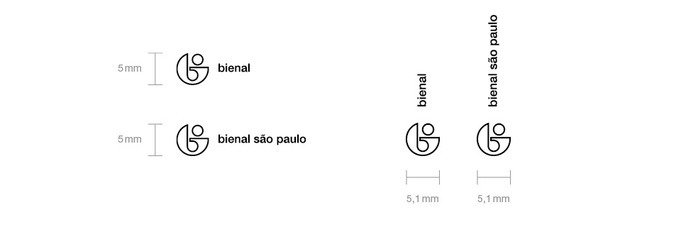
“Biennial” and “Bienal São Paulo” should be chosen considering the context in which the piece is produced; respectively national or international. The use of the isolated signal is allowed in special situations, on request.

Typeface family
The official typeface of the visual identity is Neue Helvetica (LT Std ® Linotype). There is no other auxiliary source. However, when it is necessary to use a system font, Arial is indicated. The weight used in the signatures is Helvetica Neue LT Std 65 Medium.

Colours
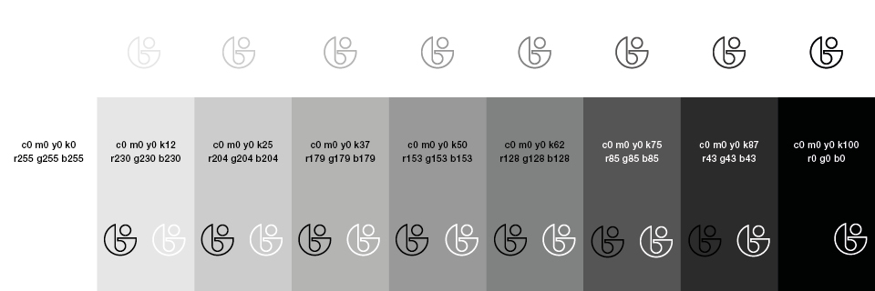
The official colors of the visual identity system are white, black and gray. When used on backgrounds of another color, the signatures must necessarily be used in white or black. Signatures in gray versions can only be used on a white background.

Minimum sizes
The minimum height of all horizontal signatures is 5mm or 30px. The minimum width of vertical signatures is 5.1mm or 32px. Applications where it is not possible to respect the minimum size will be evaluated by Fundação Bienal’s Communication – Design team.

Protection areas
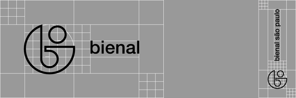
There must be a minimum area around all signatures. Above, below, to the right and to the left of the signature, a protection area equal to half the width of the sign (regardless of typography) is established.

Files
Branding signatures are available in EPS format. For other formats, contact the Communication – Design team.